


Custom T-shirts, how to make your design stand out!
Many people have probably wanted to design their own Custom T-shirts for events such as live concerts or cultural festivals. If you are going to go to the trouble of creating something original, you want it to be an eye-catching design, not just a mediocre shirt. What methods can be used to make them stand out as much as possible? So, we have conducted a survey on "eye-catching custom T-shirts designs.
Survey Implementation Overview
- ■Survey area: Nationwide
- ■Survey targets: Any age, male or female
- ■Survey period: February 18, 2016 to March 03, 2016
- ■Valid responses: 100 samples
Questionnaire results
The most common answers were...
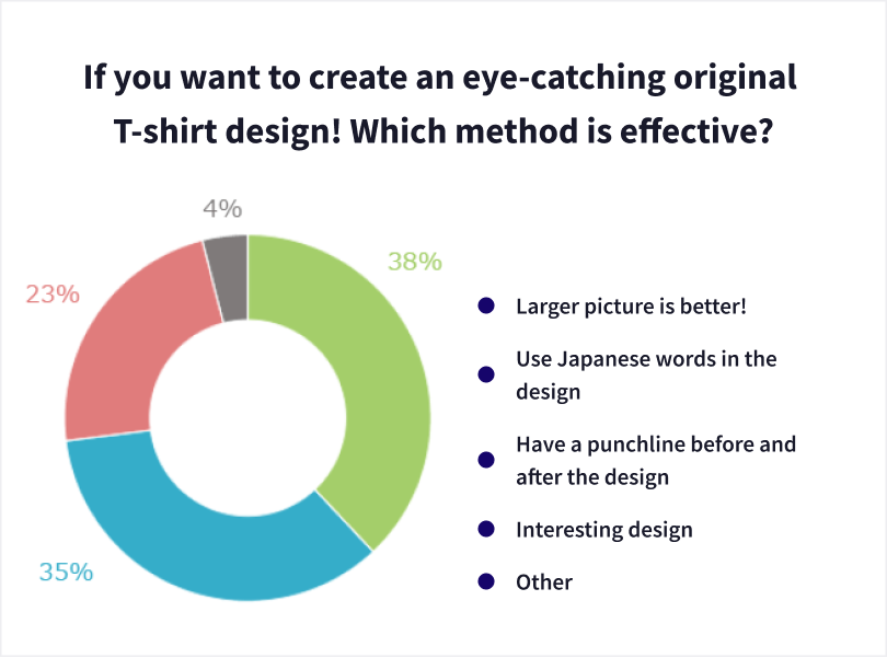
What's the best if it's bizarre? Big pictures work best, after all!
The most common response to the survey was "the larger the picture, the better".
- Printing an impactful pattern is good to stand out from a distance. (40s / male / office worker)
- If you choose a design with clear colors and a large picture, it will be eye-catching. (20s / Female / freelance/free business)
- A large pattern will make a T-shirt with a quick impact. (40s / male / office worker)
- I think it's a matter of visuals if it's quick and eye-catching, you have to read the letters (30s / male / office worker)
- I tend to look at large, interesting illustrations. It catches my attention. (20s / Female / Housewife)
Incorporating large pictures into a design is a very easy and highly effective way to do so. Even from a distance, it is easier to understand than text, and many people will pay attention to it without thinking. In addition to this, if the design of the picture itself is eccentric, or if the colors and placement of the picture are designed in a creative way, it is possible to create a t-shirt that stands out considerably by itself.
Putting Japanese in the design is also popular! Some people make ochis before and after!
The second most common response to the survey was "use of Japanese in the design," followed by "interesting design with a back and forth punchline.
- Most T-shirts use the Roman alphabet, so it is rather unusual. (40s / Female / Unemployed)
- Because I think it is rare to see Japanese people wearing T-shirts with Japanese words. (20s / Female / Company employee)
- There are lots of English T-shirts, so on the contrary, I think Japanese will stand out. (30s / Male / Part-time job)
- It was because I was impressed by the matching T-shirts of club activities and circles, which had a stylish punchline between the sentence from the front and the one written on the back. (50s / Female / Company employee)
- I think the most eye-catching ones are the ones that make you read and think. (50s / male / company employee)
Many people already wear shirts with English printed on them, and they are usually sold in stores. However, those with Japanese designs are rare, and for most people, they are naturally more familiar with Japanese than English, so if they see one, they may read it without thinking. Also, if the design has a back-and-forth punchline, there are likely to be many people who, once they see one side, will be curious about the other side and will not be able to take their eyes off the page. If the content is interesting, it will leave a lasting impression.
Pictures and text... not hard to catch people's attention!
The survey results showed that the most popular method was to use a larger picture. This is easier to understand than text, and is a great way to strengthen the impact of a basic yet powerful message. Also, if Japanese is incorporated into the design, many people will be inclined to read it. The fact that few people wear shirts with Japanese is also a major factor. It also seems to be effective enough to attract people with humor, like a design that has an ochi before and after. Thus, shirts that stand out can be made without using very complicated techniques. Hopefully, you can make your original design t-shirts unique and wonderful while matching them to the place or event where they will be worn.
Other Responses
If you want to create an eye-catching custom T-shirts design! Which method is effective?
【Use Japanese in design】
- If the text is in Japanese and a little longer, I want to read it when I see it quickly. (20's / female / student)
- I think it would be good to use letters that look motivating. I have an image of bold and strong letters. (40's/Female/Part-time job)
- Aside from kawaii and cool, what catches the eye is anything that uses the Japanese language. I think hiragana is more eye-catching than kanji or katakana. (40s / female / housewife)
- If there is writing on the T-shirt, I am motivated to read it, and if there is a thoughtful twist or word there, I feel that I have achieved my goal. (40s / male / unemployed)
- Using a single letter that has a big impact or using a famous sentence in Japanese seems to look good. (50s / female / part-time job)
- Because Japanese shirts are popular among foreigners. Because the others are all over the world. (40's / female / housewife)
- Because I think it is rare to see Japanese people wearing T-shirts with Japanese words. (20's / Female / Company employee)
- Regardless of whether I personally want to wear it or not, Japanese is considered to be the most eye-catching since the contents are visible to the public. (40s / male / public employee)
- I think it is good because there are few products with Japanese language designs and they have a strong impact. (20s / female / student)
- Even if it is just one point, I think it is cute to use Japanese, especially hiragana. (40s / Female / Company employee)
- T-shirts with English designs are common, but T-shirts with Japanese designs are novel and eye-catching. (10s / male / student)
- There are lots of English T-shirts, so on the contrary, I think Japanese stands out. (30's / male / part-timer)
- It would be interesting if it had Japanese in the design, and it would catch people's attention because they would wonder why it was written. (20s / female / unemployed)
- I think it stands out because you can create a unique impression just by using Japanese and you can't help but read it (20s / female / unemployed).
- If it has impactful words in large letters, it would catch my attention. (40s / female / part-timer)
- Today, when many foreigners visit Japan, I think that a logo such as Chinese characters is good to attract the attention of foreigners. (50s / male / company employee)
- This is the result based on my past experiences (20s / male / student).
- It is Japanese because I wear it, and there are people who use English, but it is not very desirable (40s / male / company employee)
- I think a T-shirt with a single kanji character would be good. I think there are cool kanji characters. (30s / male / unemployed)
- A design that uses Japanese might be good. Because I tend to read it (30's / male / unemployed)
- Because it seems to be accepted by foreign tourists. If I were to sell it, I think it would be to foreign countries. (30's / male / company employee)
- Using Japanese definitely catches the eye. The adidas patterned clothes written in katakana that used to be on the market also stood out a lot. (20s / female / student)
- Foreigners are very fond of Kanji characters, so I will use a single brush stroke to create a design with impact. (20's / Male / Student)
- Japanese-language designs are rare, so they are eye-catching and fashionable. (30's / male / office worker)
- If it is written in Japanese, I think it will catch the eye because the meaning is clear. 2 characters in large letters will stand out. (20's / Female / Company employee)
- I think that a Japanese T-shirt that stands out majestically among appropriate English T-shirts that have no meaning stands out in a certain way more than one with a large illustration. (10s / male / student)
- Since there are many English characters, using Japanese characters, not proverbial ones, but natural Kanji characters, will stand out. (20s / female / student)
- Kanji characters are simple and have impact, so I think they are easy to catch the eye. (30's / male / self-employed (sole proprietor))
- The Japanese language, and a single kanji character, has a strong impact at first glance (40s / Female / freelance)
- When Japanese is designed, I tend to look at it and read it. (30's / Male / Contract worker)
- I often see English alphabets used very often, but not so many Japanese ones (40s / male / part-time job)
- I have not seen many T-shirts with Japan on them, so they will stand out. (30's / female / housewife)
- If a T-shirt design has Japanese words on it, most people will stop to read it. Because I am like that. (50s / male / freelance/free business)
- I think that a single kanji character written in large letters on the chest has a big impact. (50s / male / unemployed)
- Most T-shirts use the Roman alphabet, so it is rather unusual. (40s / female / unemployed)
【The bigger the picture, the better】
- Large patterns seem to make a T-shirt with a quick impact. (40s / male / office worker)
- From the standpoint of eye-catching, I think a large picture is more noticeable (40s / female / housewife)
- I think it's a matter of visuals if it catches the eye quickly, and you have to read the letters to understand (30's / male / company employee)
- I think it will be an eye-catching design if you choose one with clear colors and a large pattern. (20's / Female / freelance)
- The larger the illustration, the more it stands out. When I see it in a store, I often pick it up I often pick it up when I see it in a store. (20's / female / student)
- Printing an impactful pattern is good to stand out from a distance. (40s / male / office worker)
- Because I think that a large picture is more impressive and prominent and will catch people's attention. (40s / female / office worker)
- Large objects are clearly visible from a distance, and if you can't see them, there is no way to draw the eye. (50's / female / housewife)
- If you want to create an custom T-shirts design that catches the eye quickly, it should be a picture with impact (30s / male / company employee)
- If you want an custom T-shirts that catches the eye, a T-shirt with a large design is good. A large design is eye-catching.
- I chose this one because a large picture would be eye-catching (20s / male / office worker)
- I chose this one because I think it will have more impact by making the picture larger. (20s / female / housewife)
- It is an image of an old lady in Osaka. It's the one that puts the picture in the front and makes an impact. (70s / male / unemployed)
- I hope the picture is large enough to catch the eye and pretty enough to be pretty. I thought I wanted it. (50s / female / part-timer)
- Whatever the item is, if the illustration or logo is large, I thought it alone would catch the eye and make an impression. (20s / female / student)
- The larger the pattern, the more appealing it will be, and it will also cover my body shape. (40's / Female / Other professional)
- I think that a large picture will catch the eye from a distance. I want it to have an impact at a glance (30s / female / part-timer)
- I tend to look at large, interesting illustrations. It catches my attention. (20s / female / housewife)
- Anything that "reads" in either Japanese or English is just embarrassing. Only an otaku can wear these things with impunity. (40s / male / office worker)
- If you are looking for a shirt that makes an impact on people's eyesight, then using a large pattern or vivid colors will catch people's attention. I think so. (60's / Female / Contract worker)
- I think a larger picture would make it easier to catch a glimpse. The back and forth punchline is also interesting, but there is a high possibility that people will not notice it. (20s / female / unemployed)
- Because it needs to be something that attracts interest when you see it anyway. (20's / male / student)
- I think that large, prominent designs are easy to recognize because they can be seen from a distance. (30's / female / housewife)
- I think it is the big picture that catches the eye from a distance. It conveys the atmosphere to both children and adults. (30's / female / office worker)
- I still think a large picture that stands out at a quick glance is effective. I don't think many people care much about the words on a T-shirt. (20s / male / self-employed (sole proprietor))
- Large designs are eye-catching and highly recommended. It allows you to assert your individuality. (30s / female / unemployed)
- I would prefer to have a large picture design on the entire surface rather than a single point on the chest. (30's / female / housewife)
- I think that to be eye-catching, it needs to have an impact, so I thought that a large picture was the best. (30s / female / unemployed)
- I think it is good if it is large, innovative, and cute because the design is the most noticeable (20s / female / part-time job)
- I want to make a design with a large picture because letters are too childish. (20s / male / office worker)
- I think that Custom T-shirts with large designs will catch the eye (30s / female / part-timer)
- If it is eye-catching, it would be nice if it has large, colorful illustrations or letters (30's / female / office worker)
- Because it stood out and seemed to catch the attention of people on the street. Because it is easier to understand if it is large. (20s / female / housewife)
- I think it will be eye-catching if you put a big and impactful picture on the wall.
- If the pattern is large, it will catch the eye anyway. Would flashy colors be good? (40s / male / other professional)
- Simply because I thought that a larger picture would catch the eye more easily. (30's / female / part-timer)
- I think something with a woman's body printed on it would be eye-catching. (20's / female / housewife)
- With text elements, it takes a few seconds to understand, but with patterns, the image can be conveyed the moment you see it. (20s / male / company employee)
【Interesting design with a front and back punch】
- If there is a punchline before and after, it is easier to catch the eye because people will see it over and over again. (60's / female / housewife)
- If it's an ostentatious piece that I'm not embarrassed to wear, I think it's eye-catching and cute (40s / female / housewife)
- If you want to make an custom T-shirts design that catches the eye quickly, I think an interesting design with a punchline before and after is effective, so that's what I chose. (30s / male / office worker)
- Japanese is so common in the design that it might stand out more if there is an ouchi. (40s / male / self-employed (sole proprietor))
- If you go for young people these days, there is definitely more hope for sales with a design that emphasizes fun (10s/Female/Student)
- I think it would be interesting and eye-catching if people see the T-shirt when passing by and feel the gap between the front and back. (50's / Female / Liberal trade / Freelance)
- There are plenty of commercially available ones that use Japanese or are large in size, but it is only the original that can create the back and forth punch lines. (40s / Female / Contract worker)
- I think the most eye-catching ones are the ones that make you read and think. (50s / male / company employee)
- If there is a front and back ocation, when you see that person at first glance, you might think, "Oh?" and then "Oh?" when you see the person's back when you pass by. However, if the Ochi picture or sentence is small, you may not be able to understand what is written in the first place. (50s / female / office worker)
- I once bought a T-shirt from an acquaintance because it had interesting words on it and caught my attention more than other T-shirts I had bought. (40's / female / housewife)
- I want a design that makes people who see the T-shirt smile. Like the person who sees it will say to others, "Hey, look at that" (laughs) (20s / female / company employee)
- Because it is more interesting to have a design on the front and back rather than on only one side. (30's / female / housewife)
- It was because I was impressed by the matching T-shirts of club activities and circles, which had a stylish punchline between the sentence from the front and the one written on the back. (50s / female / office worker)
- If the design is interesting and has a punchline before and after, I think I will pay attention to it. (30's / male / company employee)
- T-shirts that have an interesting design in themselves attract my attention. (30's / female / housewife)
- It may be a question of taste, but we think that a design with a punchline is very interesting and memorable. I actually never thought of this idea! It's so funny! There is also the precedent of Fukiko, who became a hit and became the talk of the town, and since T-shirts are an item with two sides, I think the idea of adding an ending to the front and back of the T-shirt is very interesting. (10s / female / student)
- If the design has a punchline before and after, I think people will see it at least twice. (60's / female / housewife)
- It is a waste to just design the front of a T-shirt and can entertain the viewer (20's / female / part time job)
- I think it is more interesting and unusual to have a punchline. (20's / female / student)
- I saw a T-shirt with a zipper printed on the back that was very cute, so I decided to go with it. But I usually wear plain ones because they are the easiest to match. (20s / female / student)
- If a funny gag is designed on the front and back of the T-shirt, I think it will catch many people's attention. (40s / male / unemployed)
- I think it is more of an interesting design with a punchline before and after. (50s / male / company employee)
- I thought it would be interesting to make a punchline either in the front or back, and complete the story with the gimmick of human movement. (20's / female / housewife)
【Other】
- I take my own pictures and use those images. Since I cannot take exactly the same picture myself, I think it will be a completely one-of-a-kind design. (50s / male / self-employed (sole proprietor))
- It would be easier for people to remember if the colors are distinctive, such as two-color patterns on the top and bottom, or different color schemes in the front and back. (40s / female / housewife)
- If the bullying gets so bad that they hide your baggage or even your savings. I would report it to the police as soon as possible. (40's / Female / Liberal trade/ Freelance).
- Color scheme. Psychedelic patterns and gradation of colors stand out. (40s / female / housewife)